The journey to designing my debut novel’s book cover and full jacket, was a lengthy and fruitful one that taught me a lot and ignited a curiosity to learn more about what this process can be and is in other forms of publishing. It was also a learning experience as a designer and a lesson in design collaboration.
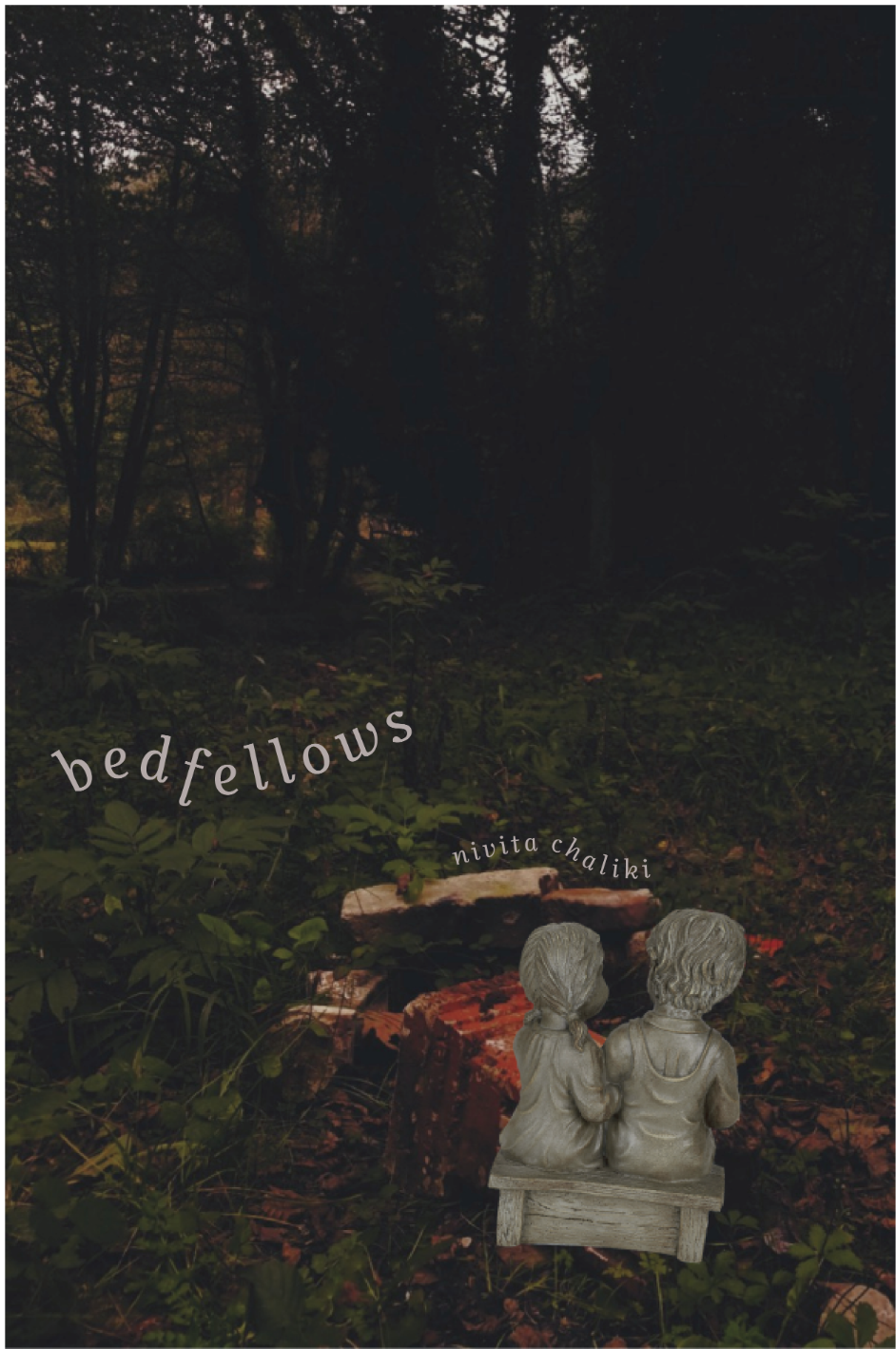
I started out with pointing out a few book covers I liked and/or wanted to channel for my book cover.


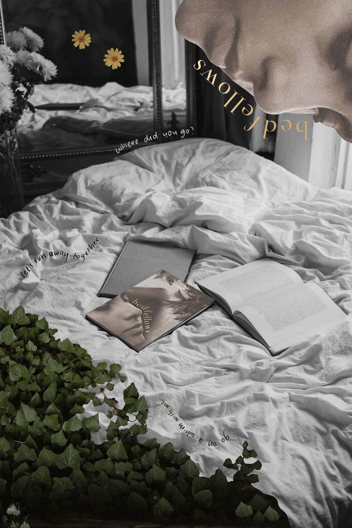
Then, I played around creating a mockup of what I wanted my cover to be, based on what I wanted to represent and trace from the book, as I knew it in its publishing stages. A lot of it was still being formulated, but I had a strong idea of the kind of aesthetic and visual impact I wanted the cover to have, and the themes and traits from the book I wanted the cover to offer the reader, both on first glance, and with careful searching.
I sent these mockups over, along with the actual book covers I resonated with, and short write-ups for each mock cover with details as to what I’m trying to represent in the book, what kinds of visuals I want, what colors, fonts, etc. I used and want used in the final cover, and more, all to the cover artist working on my project with me, Max Yenin. We then worked together on trying to create a rendering of my ideas that could work for my actual cover, using the mockups, descriptions, and additional images. Taking from that, he got back to me with potential design directions to choose from and move forward with.
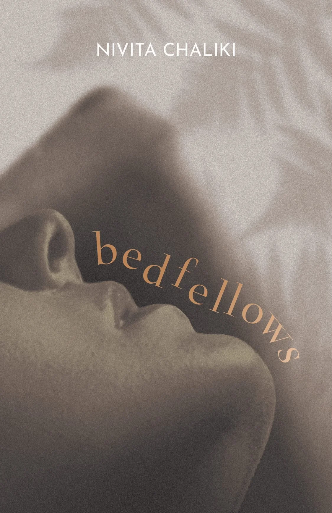


I wasn’t quite happy with the way the final options turned out, and tried to play around with different elements in the proposed designs. It was an exercise in understanding that descriptors like ‘warm’ or ‘intimate’ are actually not very definitive to use when collaborating on a design. More concrete things, like specific objects, colors, typefaces, etc. is what makes it possible to collaborate and achieve a result we’re all happy with. So I tried to explore options with the cover artist regarding the colors, images used, layout, etc. I tried to create more mockups, rougher but with visuals closer to what I was envisioning, to try and communicate what I wanted and what wasn’t working. I broke it all down in a spreadsheet where I linked the overlay mockups, and other stock images similar to what I was envisioning in case that was an easier reference to use and apply. I ended up just grabbing my camera and taking photographs to achieve the visuals I wanted and really communicate the nuance aesthetics I was looking for.


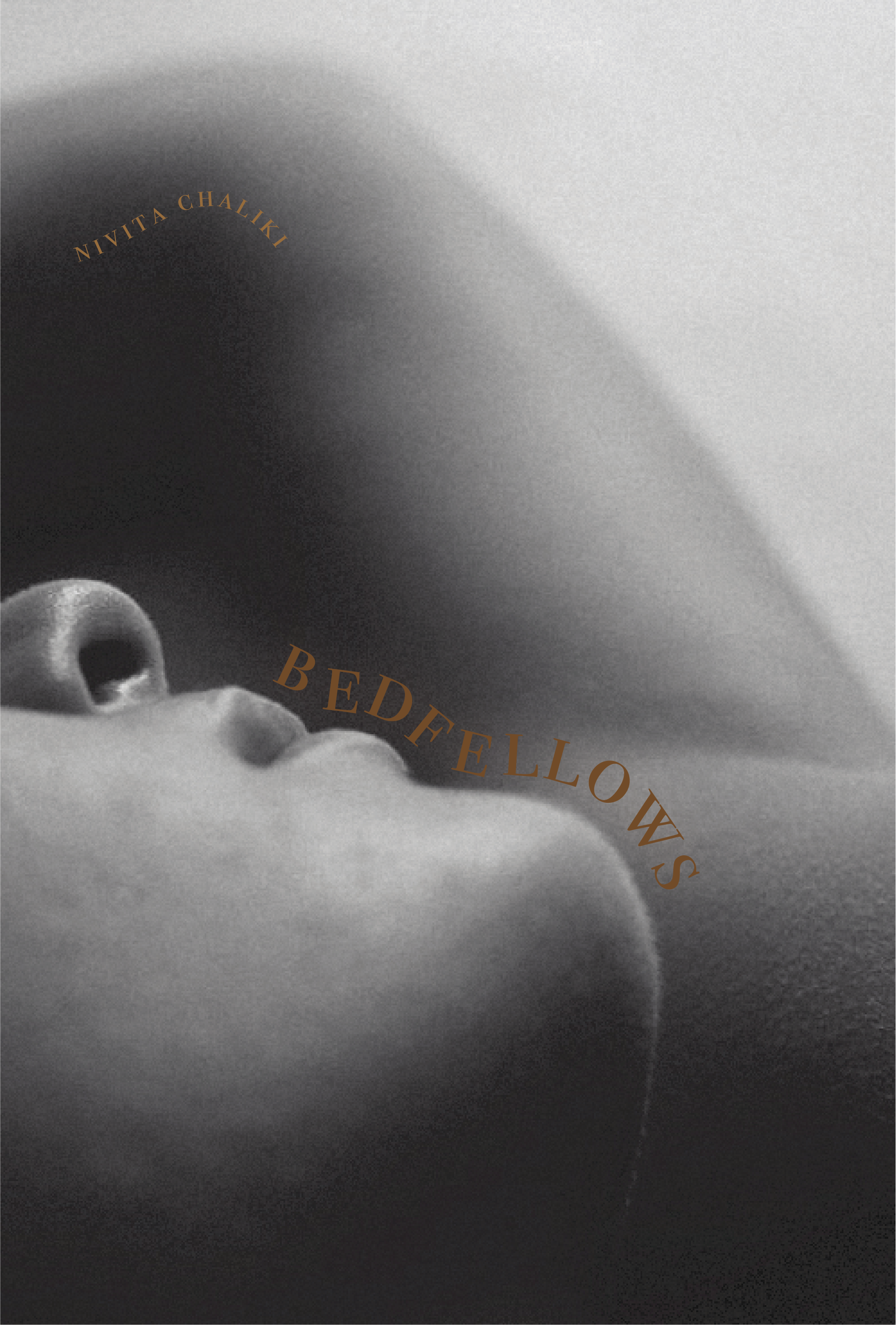
After that, the design team and I were able to find a more even cadence on communicating what exactly I wanted from this cover. With the second round of rough mockups, and utilizing what I could to visually communicate, we came to the final design, give or take a few small changes here and there!

And then after the book cover design, came the applications of design to other aspects of the publishing process. Since I took the route of crowdfunding for the publishing costs of my novel, I wanted to give supporters a little special something with their books when I mailed them out. I started out with a sticker sheet I collaged from different elements from the book, that people could trace back to as they read, and decided on a little envelope of pieces from three main characters in the book. A sticker, meant to represent Kash (the face of the book), a guitar pick meant to represent Rafi, and a bookmark with a quote by Levi.